Mainstreet Credit Union
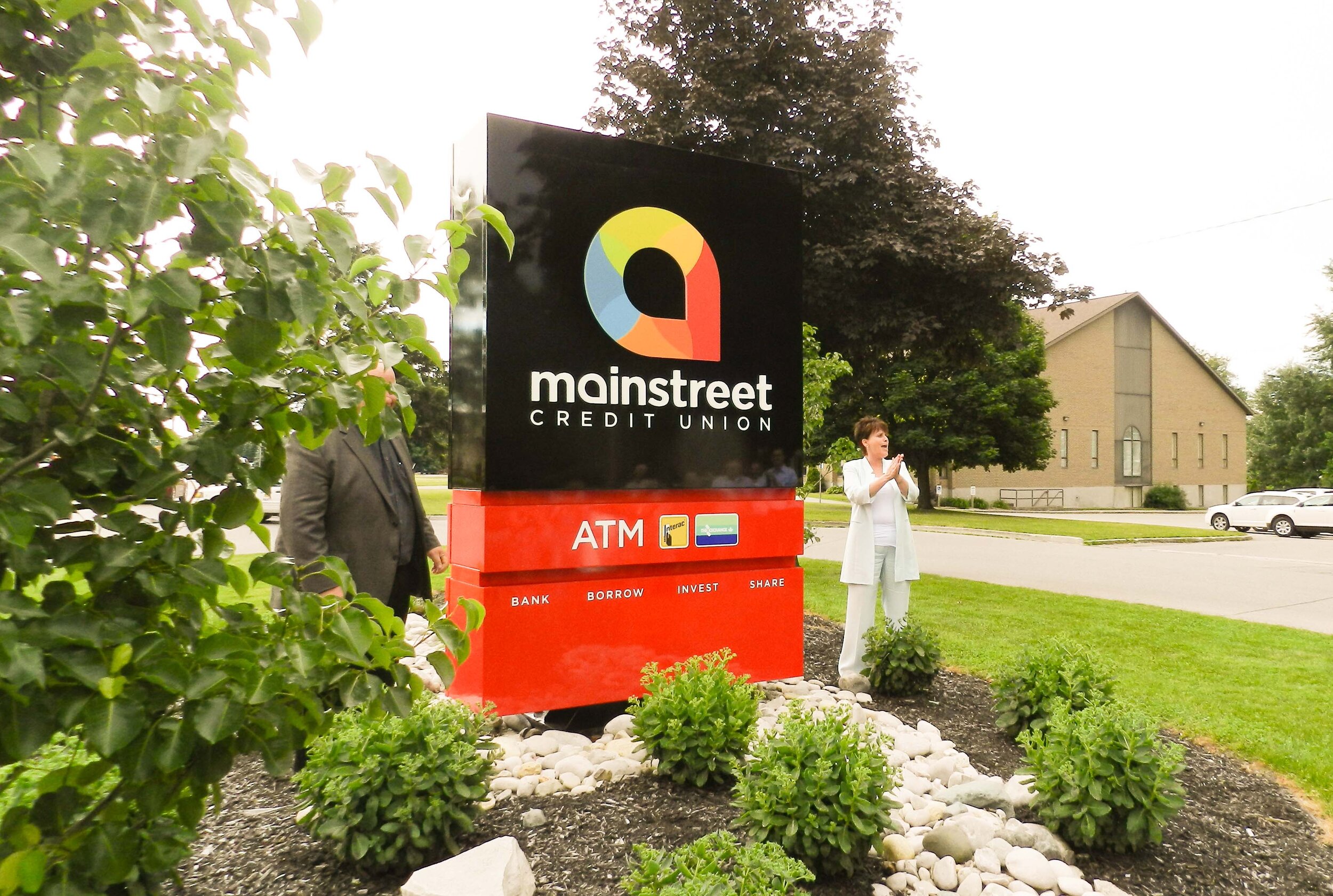
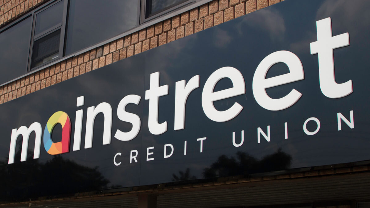
Two credit unions were merging and required a fresh new identity and branding system to launch aggressively in Southern Ontario. We developed this identity to bring new energy into what’s generally thought of as a boring industry.
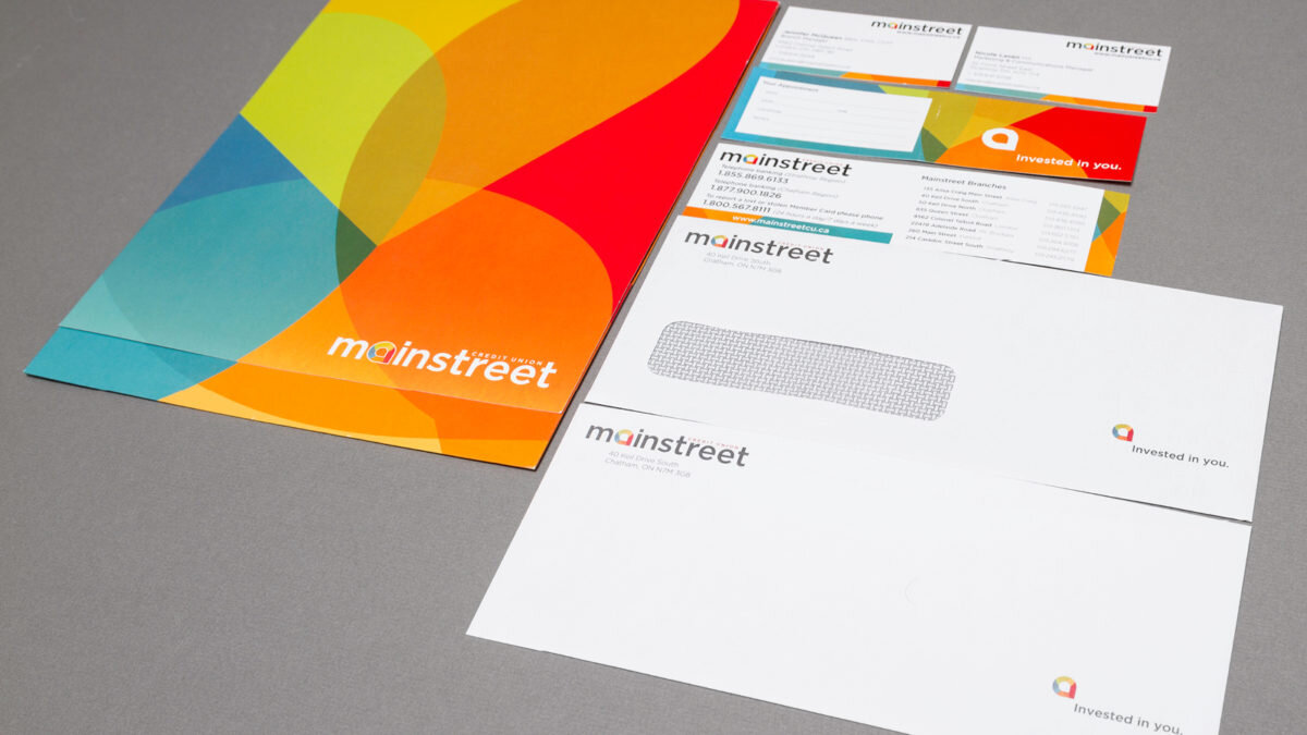
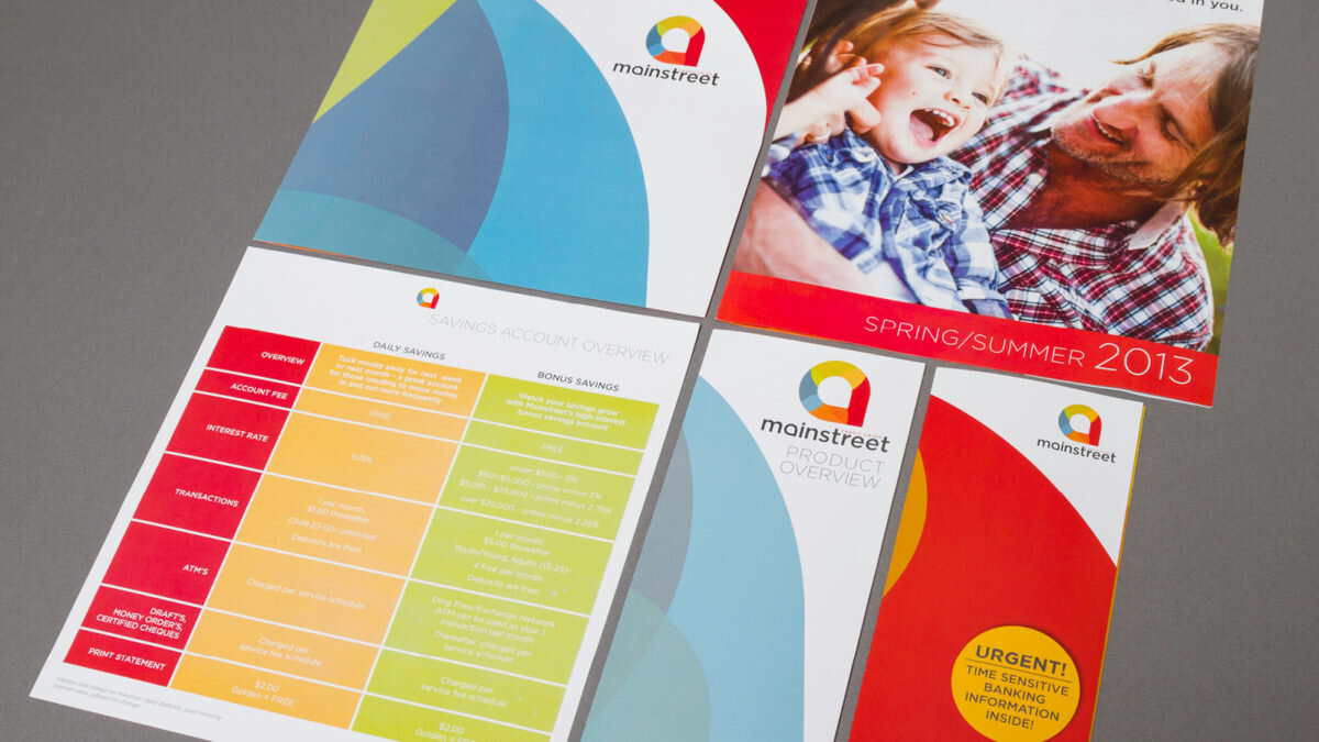
The warm colours are an extreme diversion from what they had used previously and were overwhelmingly welcomed by the staff and clients when launched. An icon was developed that represents growth but also stability and the multi-coloured palette provides the energy. We also designed the many branded business communication materials that any banking institution would need.
They have gone on to rapidly expand and claim the energetic branding has brought in a younger generation of customers that likely wouldn’t have taken notice.
mainstcu.com
